Healthcare · 2026
Modal wizard to a visible decision tree
Owned the Form Builder 2.0 redesign for a clinical EMR — the tool a non-technical clinic uses to author intake, encode its eligibility gates and take an order, without an engineer.
0 dialogsTo edit a field or author a rule. Forms 1.0 opened a popup for each, so the form was never visible beside the change being made to it
- Role
- Product Designer
- Client
- Wizlo
- Duration
- ~13 prototype variants across 8 tickets
- Year
- 2026
- Figma
- Claude
- ChatGPT
Context
- The business
- Wizlo is a clinical and patient SaaS — EMR and telehealth — used by clinics running care paths like TRT, HRT, GLP-1 weight management and hair restoration, across a provider app and a patient portal. Forms are its front door: intake is the first clinical touchpoint, collecting PHI, medical and medication history, contraindications and consent before a patient ever speaks to a clinician.
- What was wrong
- Forms 1.0 was a step-by-step wizard. Editing a field opened a popup; authoring a rule opened another, so the form was never on screen beside the thing being changed. That was merely slow for a ten-field form and actively risky for a fourteen-page branching intake, because conditional logic in a telehealth clinic is not cosmetic — a rule like "history of thyroid carcinoma → disqualify" is a clinical safety gate, and it was the most buried thing in the product.
- What I did
- I replaced the wizard with a three-panel direct-manipulation canvas, then built the logic layer twice over: inline rule cards in the properties panel that read back as plain English, and a full-screen node canvas where every page is a node and every arrow a real condition — with a simulate mode that walks a branch as a patient would, before anything is published.
- A multi-designer initiative. I authored the foundational redesign, the forms hub and the whole logic and AI layer; the later refinement passes, the sprint-scoped template gallery and the Brand Studio styling integration were colleagues' work.
- Parity before expansion. The migration pass was explicitly forbidden from adding operators, because a clinician who already knew a 1.0 rule had to be able to author it in the new panel without training.
- Checkout and identity verification are Gr4vy's and Vouched's interfaces at runtime, so the builder could only ever show placeholders for those pages — never a mockup that would not match production.
- Clinical eligibility rides on the output. An authoring mistake here is not a cosmetic bug, so the tool had to make a wrong rule hard to write and easy to see.
What changed
0 dialogs
To edit a field or author a rule. Forms 1.0 opened a popup for each, so the form was never visible beside the change being made to it
8 operators
In the inline rule builder, with the value input adapting to the trigger field's type — a radio field offers its own options, a date field a date picker — so a nonsense comparison cannot be authored
99 fields
The deliberate stress-test template: 14 pages of branching, jump-to-page and disqualification, so the logic system could be walked end to end before any clinic had to build one
The work
01
Wizard to three panels
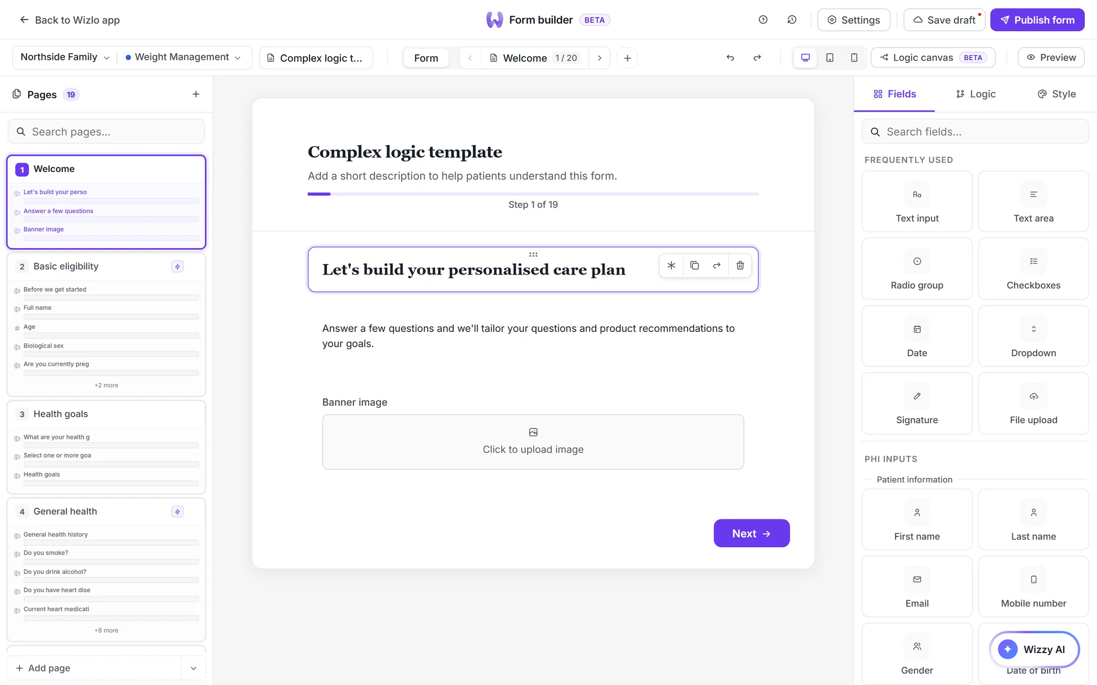
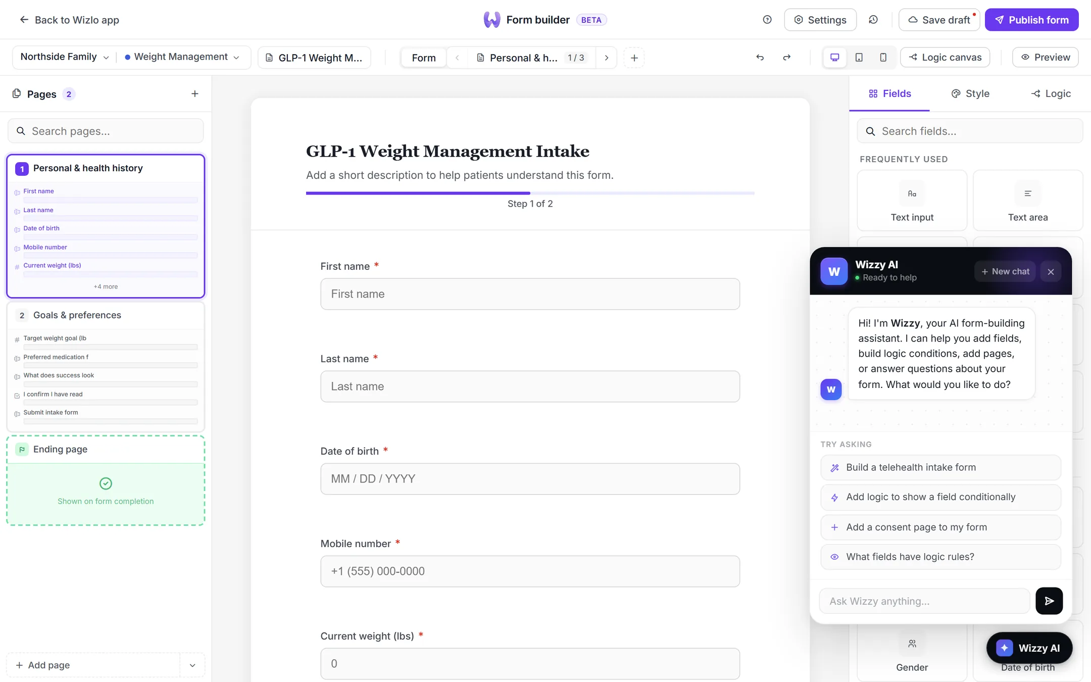
Palette and page list on the left, the form as the patient will see it in the centre, contextual properties for whatever is selected on the right. Selecting a field on the canvas populates the right panel and edits render live; drag from the palette to add, drag within the canvas to reorder. This is the single change that converts filling in a wizard into editing a document, and it is what removed the dialogs rather than merely making them prettier.
02
Rules that read back in plain English
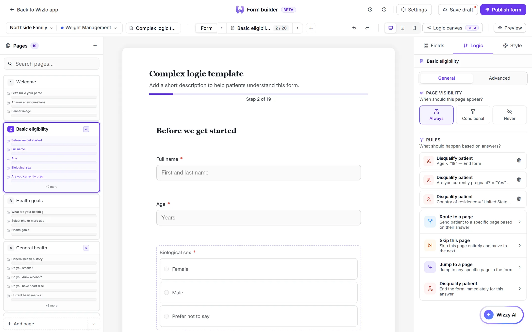
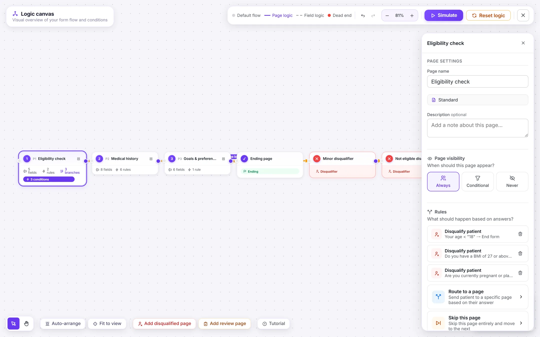
Every field and page gets a Logic tab: numbered three-step cards of trigger, operator and value, with Show, Hide, Require, Jump to and Disqualify as actions, chained by an AND/OR toggle. Under each rule sits a live sentence restating it in plain language, so nobody has to mentally compile a condition. The value input is field-type aware — pick a radio field and it offers that field's own options, a date field gets a date picker, a checkbox defaults to "is checked" — so a nonsense comparison cannot be authored in the first place.
03
Guardrails built into what the picker offers
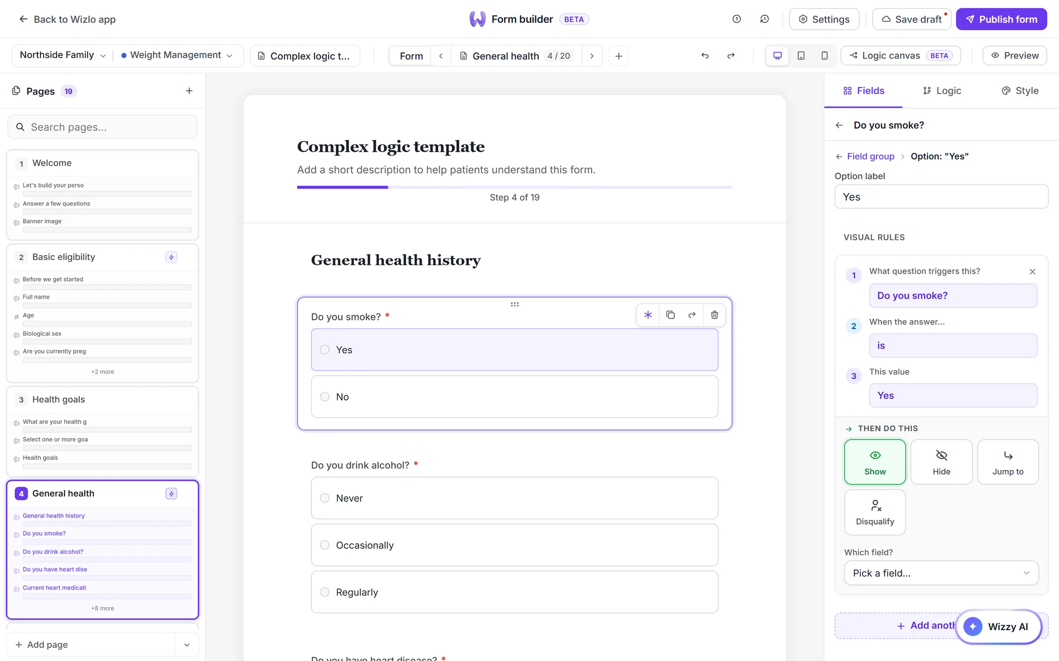
A rule is three numbered steps — what question triggers this, when the answer is, this value — then an action: show, hide, jump to, disqualify. The guardrail is in the pickers. Choose Show and the "which field?" list only offers fields that come after the trigger, so a rule cannot reach backwards and depend on an answer the patient has not given yet. The constraint is enforced by what the interface hands you, not by a validation message after the fact.
04
A canvas that shows the form's shape, and lets you walk it
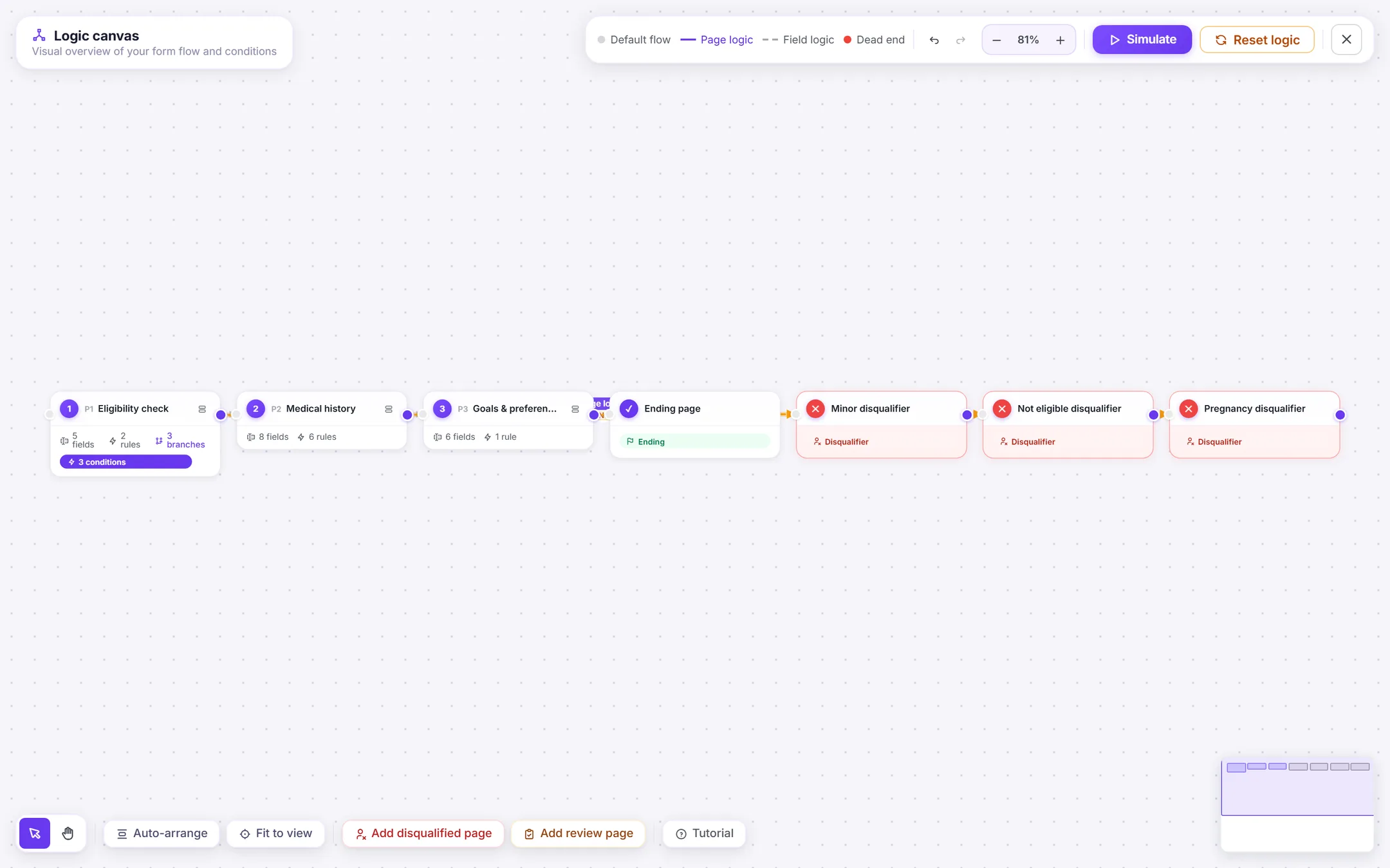
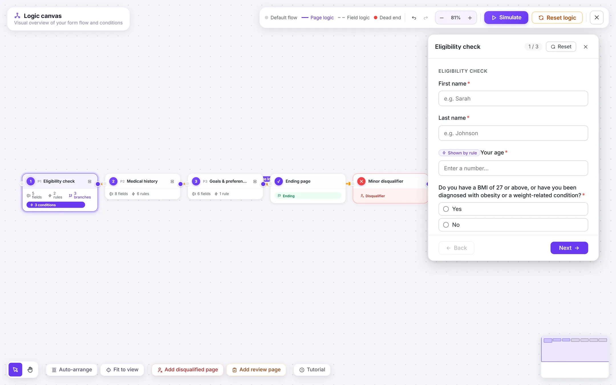
A full-screen node view: each page a draggable node, each arrow a real condition. There is deliberately no separate "default flow" concept — sequential connections are seeded on first open and share the same code path as conditional ones, so grey means unconfigured sequence and violet means conditional, and the author holds one mental model instead of two. Nodes expand to show their fields with a badge counting the rules each carries, and one page can branch to several targets, evaluated in order, first match wins. Simulate mode is the payoff: walk the form as a patient from inside the canvas, with the active node highlighted and visibility evaluated live against the real conditions. You author an eligibility gate and confirm it fires without publishing to find out — which, for a rule that decides who gets treated, is the difference between a design and a safeguard.
05
AI that refuses to guess
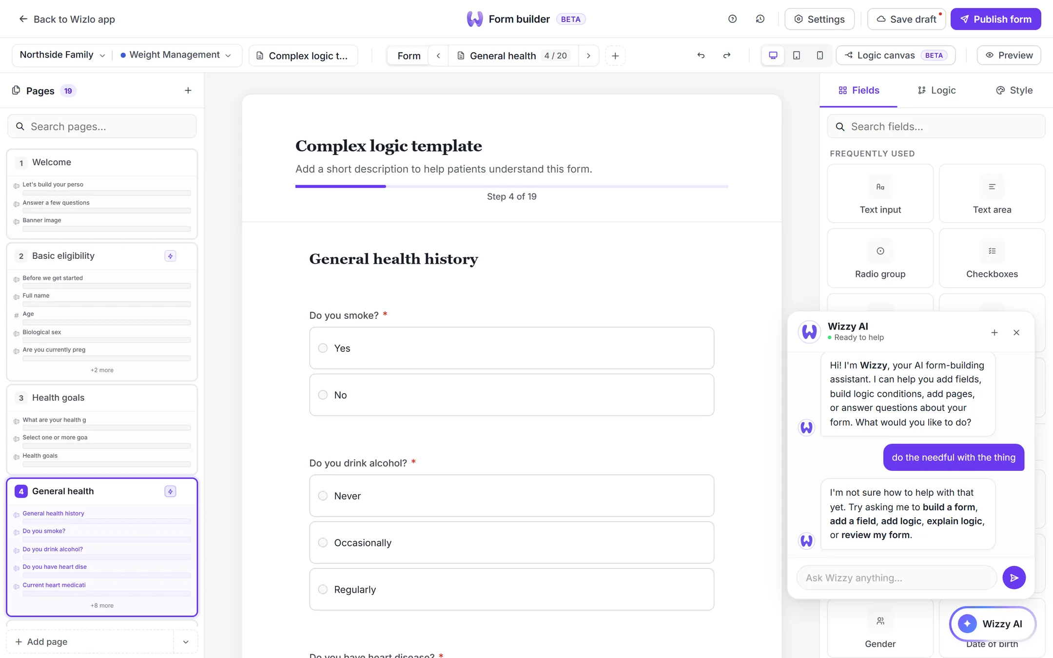
The assistant can build a form from a description, add a field, add a page or author a condition — and the part I would defend hardest is what it does when it cannot. Asked something it cannot parse, it says so and names what it does handle, rather than attaching a rule to the nearest question it can find. In a tool where a condition decides whether a patient is eligible for treatment, an AI that is confidently wrong is worse than one that admits it did not understand. Everything it does produce lands in the same editable primitives a human would have made, so nothing it touches is a black box.
06
Parity as the migration plan, and rollback as a requirement
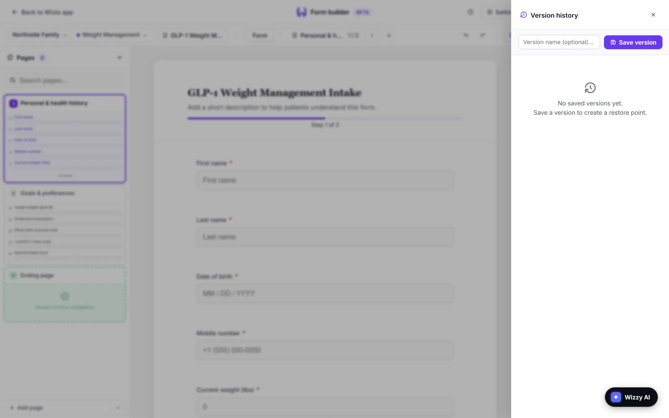
A dedicated pass mirrored 1.0's operators and actions into the new shell with no additions, so the redesign asked nobody to relearn a rule they already knew — it only removed the friction around it. Alongside it, version history keeps named snapshots of full form state with save, restore and rename, and takes an automatic backup of the current state before any restore. For a form that gates clinical eligibility, being able to undo a bad edit is a safety requirement rather than a convenience.
Before and after
Before · 6 steps
- 01Open the field's popup
- 02Open a second popup for logic
- 03Type the condition blind
- 04Dismiss both dialogs
- 05Re-read the form to see what changed
- 06Publish to find out if the branch works
After · 5 steps
- 01Select the field on the canvas
- 02Open its Logic tab in the panel
- 03Read the rule back in plain English
- 04Watch the canvas update live
- 05Walk the branch in simulate mode
More screens
The outcome
Handed off dev-ready as coded prototypes rather than static frames: every variant is genuinely usable — the CTA opens the modal, the toast fires, the branch evaluates — and each is prefixed with the ticket it came from, so any prototype maps back to the story that asked for it. What I can report is the state of the work at handoff, not its effect in production. The brief set four targets — halve median form-creation time, reorder a field in one click, publish a ten-field intake in under three minutes, and full parity with 1.0's logic. Parity I can show you in the operator mapping. The other three were the bar the design was reviewed against, and I have no post-launch measurement to say whether it cleared them. When that data exists it belongs in this section; until then, claiming it would be fiction.
0 dialogsTo edit a field or author a rule. Forms 1.0 opened a popup for each, so the form was never visible beside the change being made to it
- There are no post-launch numbers here, and I would rather say so than invent them. The metrics in the brief were design targets; what I can evidence is the work itself — the operator set, the parity mapping, the stress-test template. A case study that presents a goal as a result makes the same mistake as a form that presents a guess as an answer.
- The safety-critical feature was the buried one. Logic carried the clinical eligibility gates and lived in the deepest popup in the product, which taught me to read information architecture as a safety concern and not only a convenience one.
- Parity is a feature. The instinct on a redesign is to improve everything, and the migration pass deliberately added no operators — asking a clinician to relearn a rule they already knew would have cost more than the new capability was worth.
- Refusing to guess is a design decision. The most defensible thing in the AI layer is what it declines to do, and that only reads as rigour rather than as a bug because the interface says plainly that it did not understand.
Next case study
Prescription, not product